Brand Identity for AIRA
Project Details
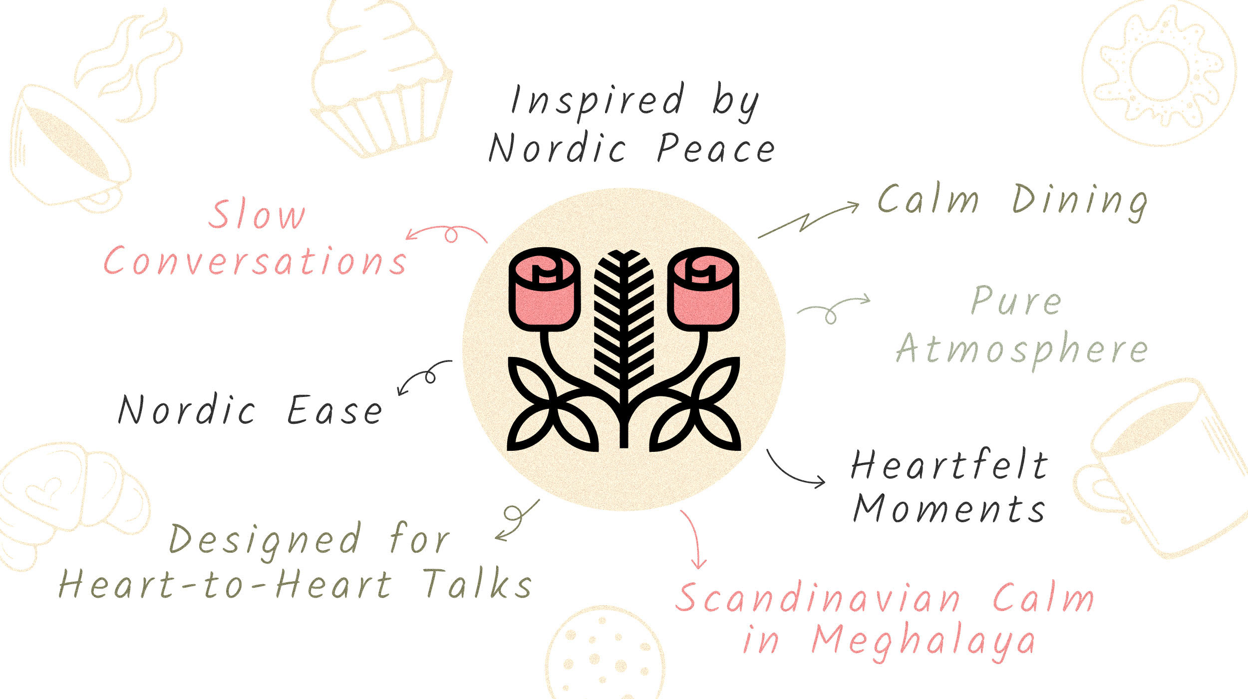
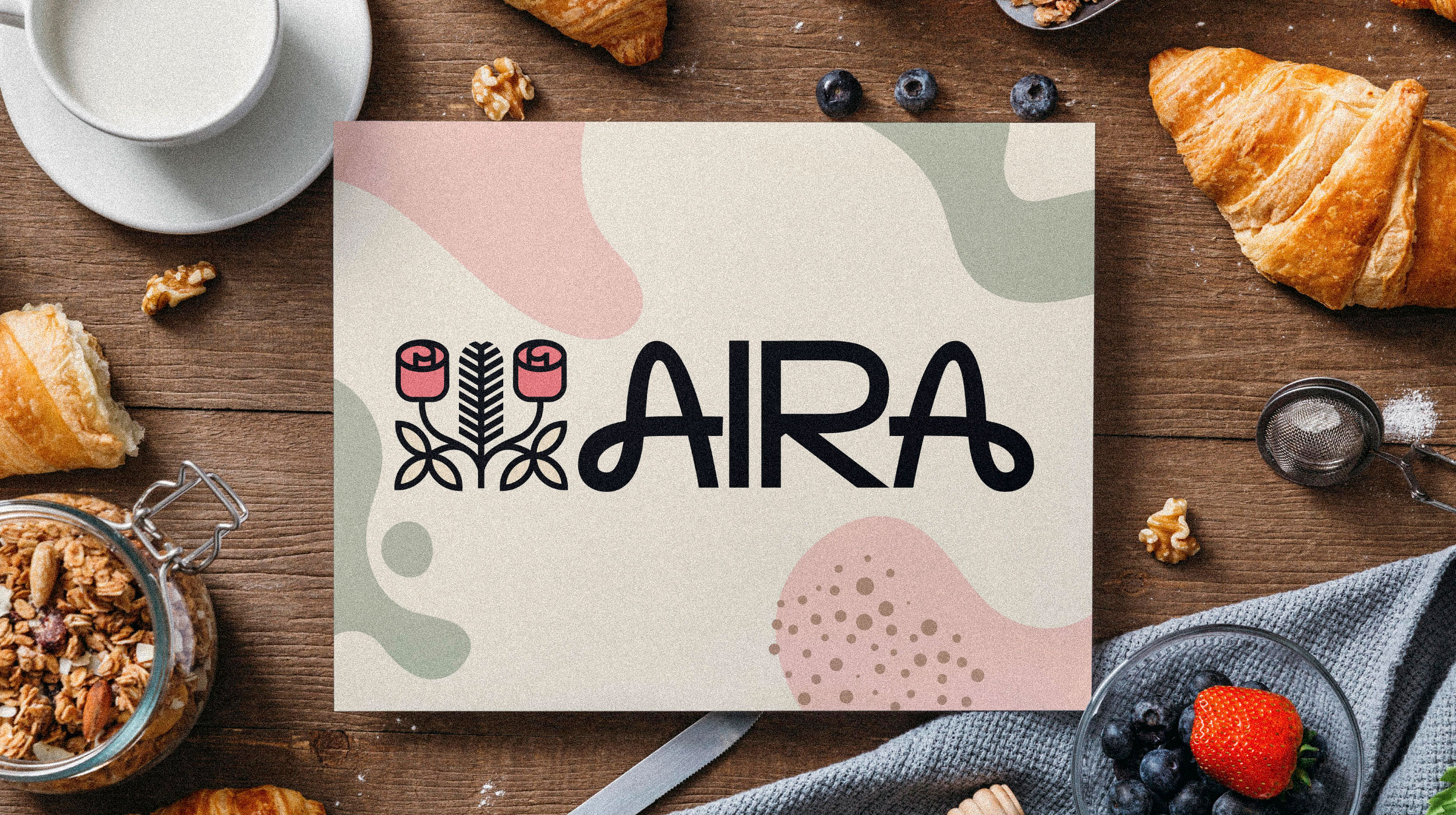
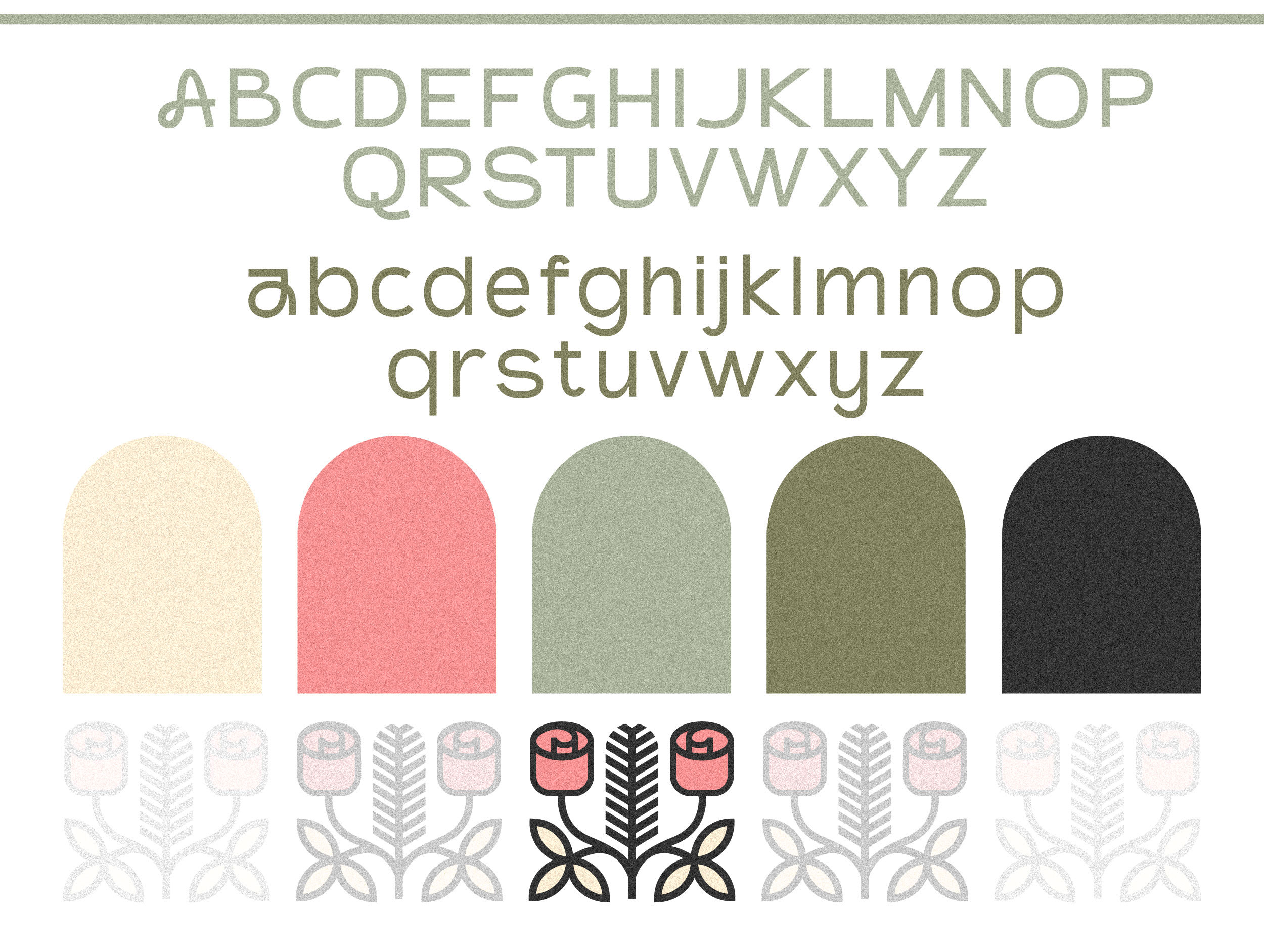
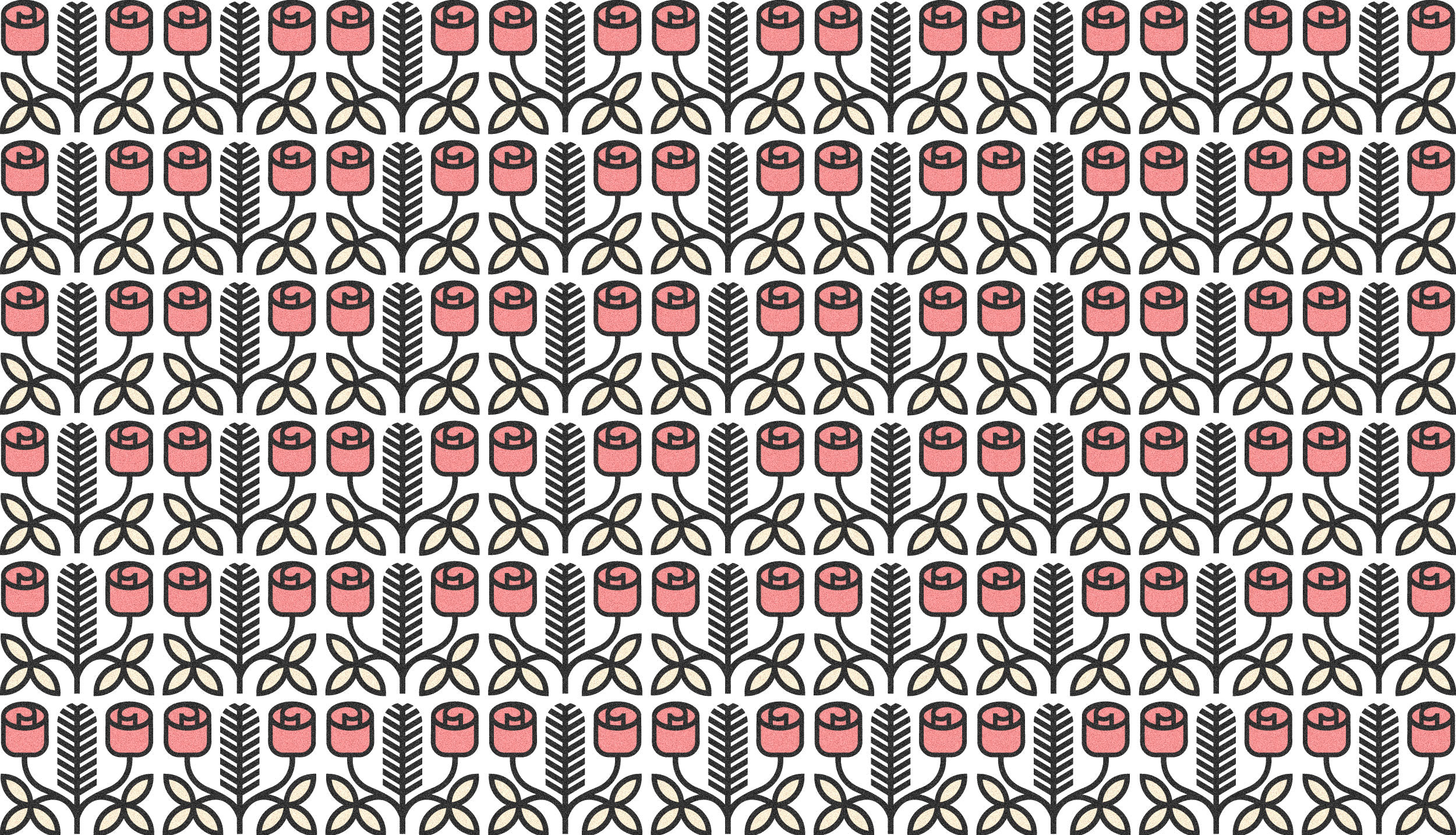
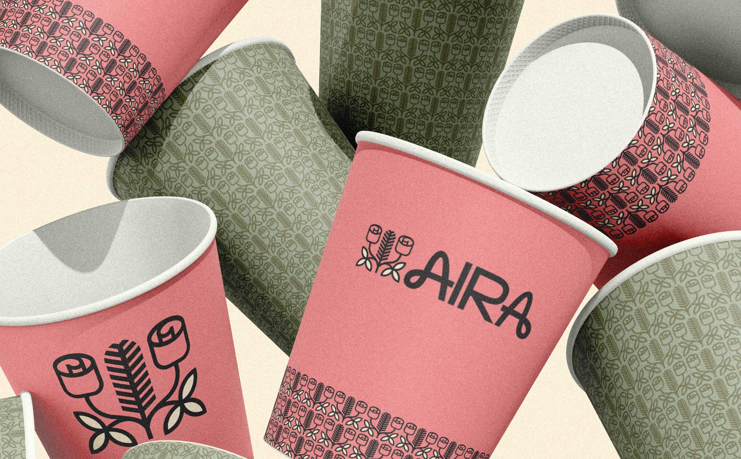
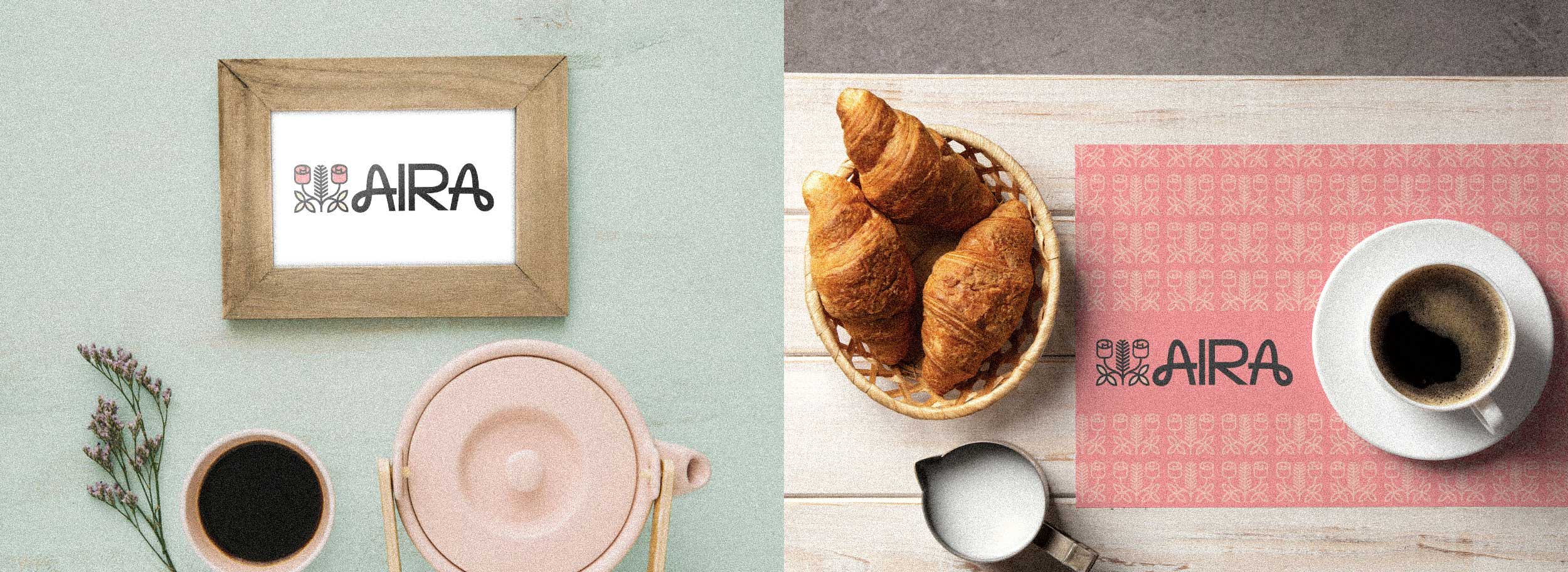
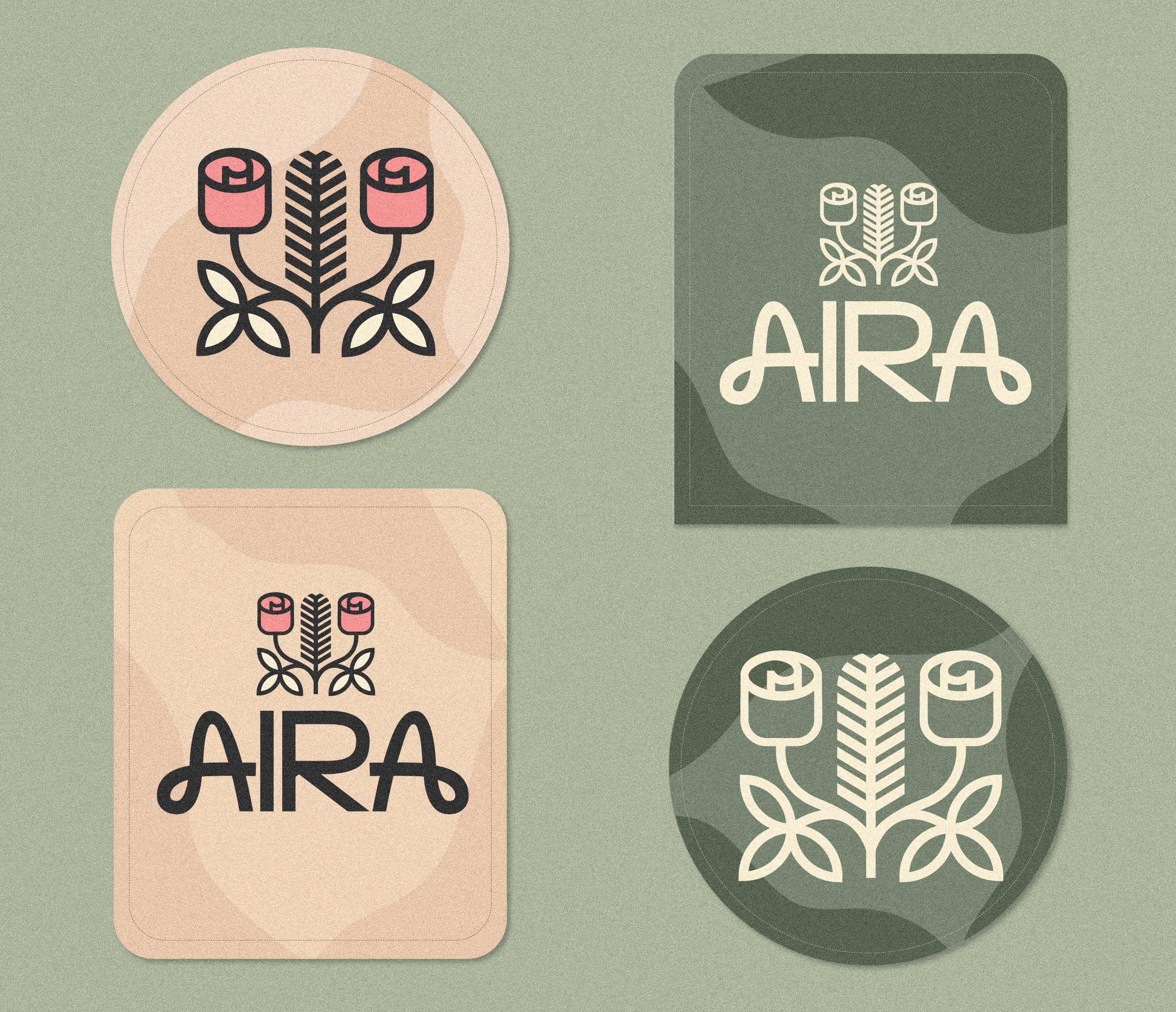
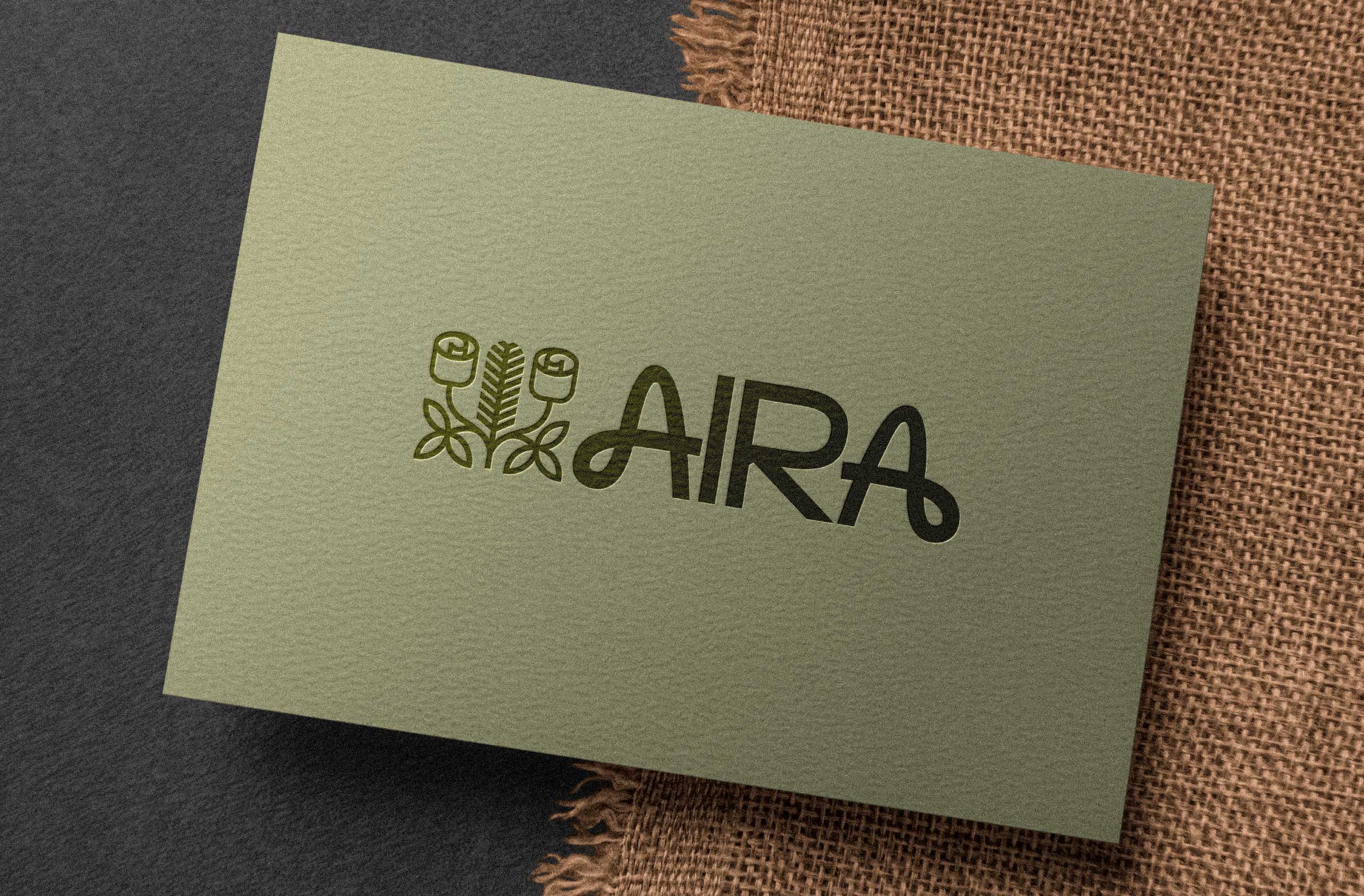
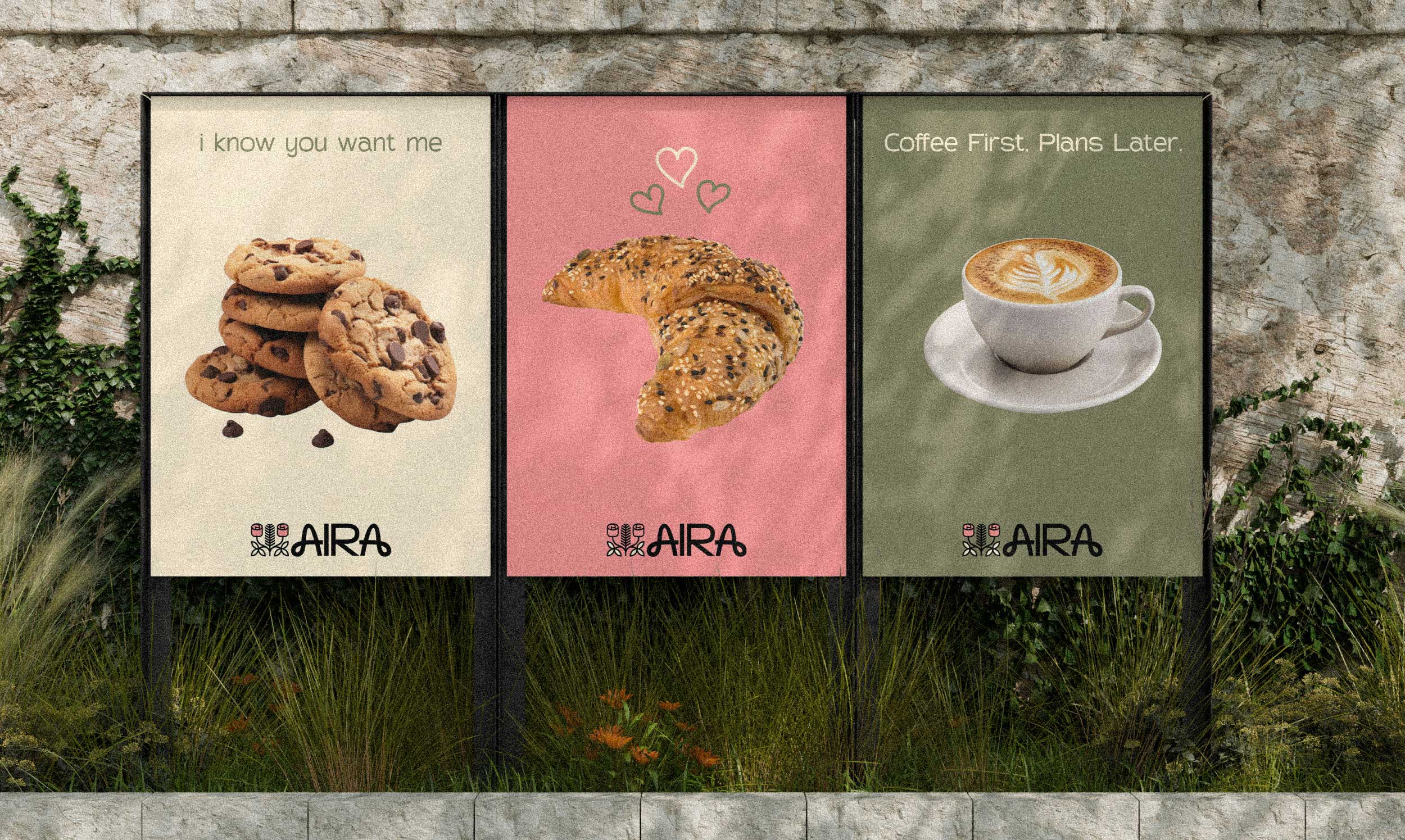
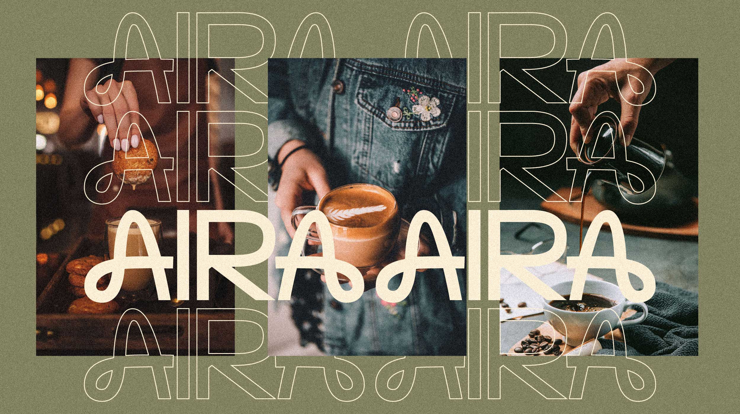
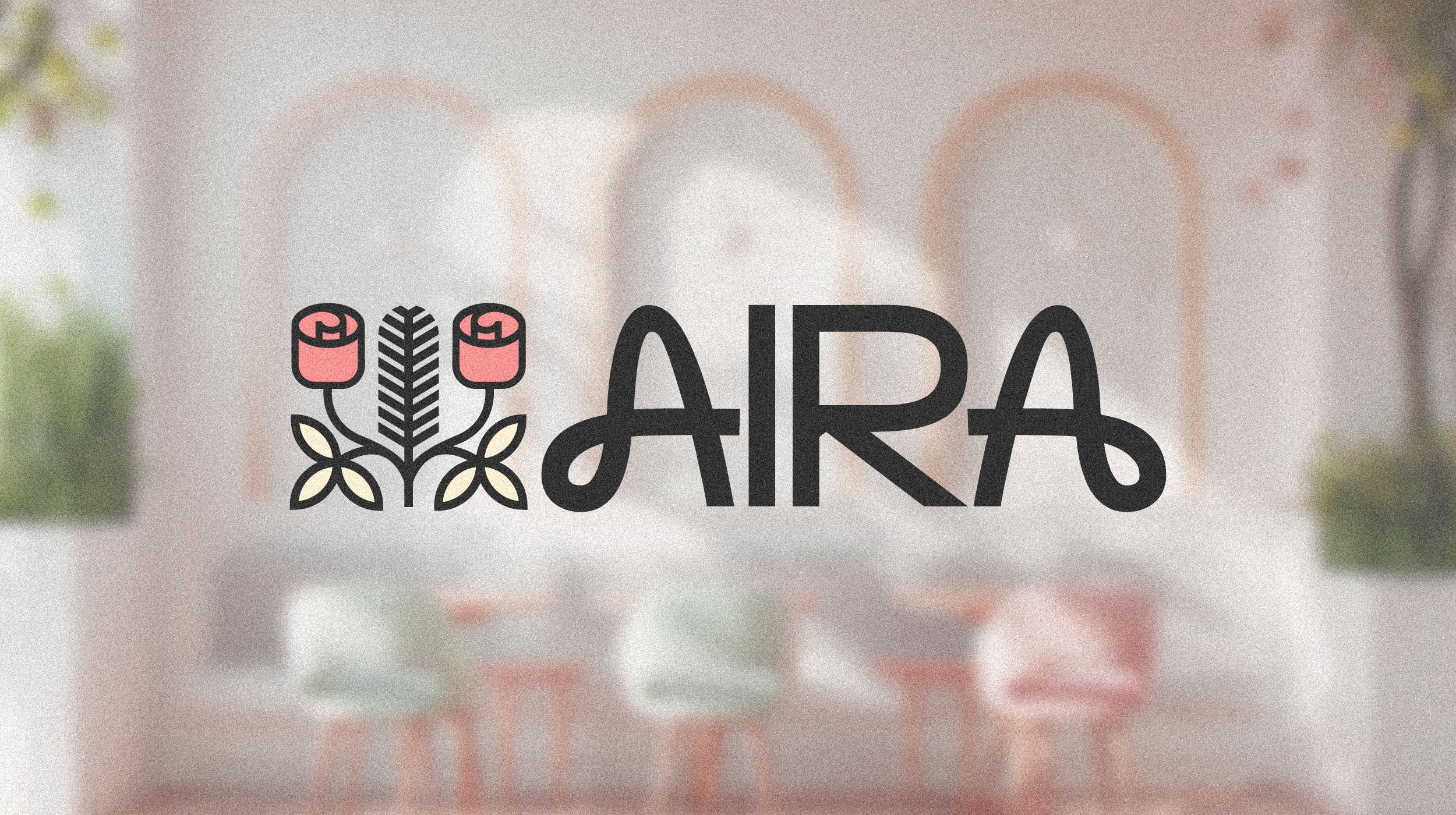
AIRA is a Scandinavian-inspired dining space created to evoke calmness, openness, and meaningful connection. The name carries the essence of “pure air” and “clarity,” aligning with the natural tranquility of Meghalaya and the minimal warmth found in Nordic design. The logo reflects this philosophy through two stylized roses, symbolizing two individuals engaging in gentle, heart-to-heart conversations. These roses are intentionally crafted in a soft, Nordic style to represent comfort, emotional warmth, and relaxed moments. At the center, a vertical leaf element acts as a meeting point—expressing balance, grounding, and togetherness. The typography uses fluid curves and modern simplicity to echo the Scandinavian principle of effortless elegance. The color palette remains subtle and peaceful, reinforcing the restaurant’s ambience: a place to slow down, breathe, and enjoy intimate conversations over good food. AIRA blends nature, design, and emotion into one serene dining experience.